Manchester calling
- emily and the line

- May 6, 2019
- 4 min read
The Manchester Blog!
We saw many pieces at the Manchester Whitworth Gallery, many more contemporary. The main exhibition we went to see was William Kentridge: Thick time. Kentridge is a South African artist renowned for his animated drawings. A lot of his work was influenced by the apartheid in South Africa and post-apartheid life there. Within his work he suggested time and history as fictional concepts and plays with re-imaging and change these concepts. This specific exhibition focus’s on various films of Kentridge’s, aimed to explore the broad field of time keeping and string theory. The immersive work combined animated sculpture, possibly in my opinion reflective of industrialisation, tapestries, film projections and artist books.
The marrying of the animated sculpture and the flickering animations sets allowing the installation to set a foreboding scene. This piece strikes me with how immersive it is and how it has not purely been created to make a visual impact, but all the other element such as the sound, sight and motion give visitors to the exhibition an overall sensory experience. The scale of the work also struck me and the projections of the work made it a panoramic visual, something the viewer get trapped in. This scale, trapping panorama and load noises made the piece something dominant commanding, the installation commands the viewer attention and pulls them into in as a sensory journey.
I think its very powerful how commanding this installation is. It’s almost as if it’s sucking the viewer into this landscape where time is just a concept and they are dwarfs by the giants almost reflective of landmarks in time, such as the animated industrial looking machine.
This work makes me reflect on my own work and how my work communicates. Kentridge’s exhibition I has a clear sense of communicating and indulging someone in an air of somewhat harmonious dystopia. Yet with my own work, it doesn’t evoke any senses nor does it have the imaginative flair Kentridge has created. It makes me wonder whether I should begin to experience with visual technique to evoke senses and feelings from people within my work, therefore making it more immersive and therefore of more interest. Alongside this it would also make my work more relatable, as I feel a lot of my work is recording life as it is, which of course creates a huge contrast to this imaginative piece that takes the observer to a whole other plane.

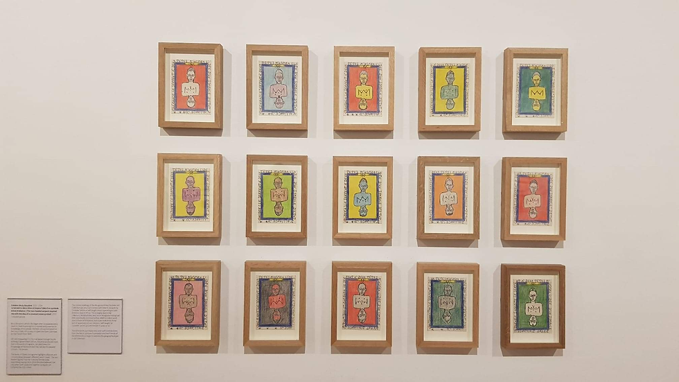
This piece caught my interest as the style of it leans more toward an illustrative stylisation. This series of 15 images are described as pictograms and have a significant meaning. I believe they were created in order to communicate a message. They are the works of a Frédéric Bruly Bouabré. Bouabre, described as “Inventor of his personal alphabet, founder of his own religion and writer, Frédéric Bruly Bouabré is a hunter of signs: signs of nature on human beings, traces of man on nature.” This implies Bouabre’s work will heavily focused and signifiers to communicating through aspects of his work. It is also clear Boubre was quite the eccentric, but the message he is communicating through this very clear.
This series of 15 pictograms was inspired by a vision he had encourage him to spread knowledge of the Bété, his people, and preserve their culture. This was crucial as the Bétés homeland in the Ivory Coast was colonised in 1943 by the French. Obviously be pursued this vision of preservation and the outcome was this beautiful and colourful collection. Although there are only 15 final images on show Bouabre created more than a thousand of these pictograms, he referred to them as his “knowledge of the world” and told that they narrate the story of his people which was his greatest concern.
What I find amazing about the work is that Bouabre really thought out the composition and even how the composition communicated. Each pictogram illustrates both the alliances and commonalities between nations through joined 2 figures together, cleverly referencing a play card. Playing cards, of course following this composition of two merged figures allowing the card to always be the right up way. I feel this visual was very well thought out and cleverly constructed. By formatting them like playing cards and having the joined figures fussed at the middle means that in unity, all the nations will always be stoof up right, but alone, they can never strongly be strong in isolation as from a different angle, they are seem upside down. Possibly a reflection of the sociology between different nation states. I feel the works general remark is, together, we are stronger. The stylisation of his work seems to lean to the cultural background he wishes to preserve with the strong poignant colours and almost tribal like mark making.
I feel I can take away a lot from this in my own practice as Bouabre’s work is an example that thinking about a composition and how it communicates really pays off and makes the overall aesthetic a lot more engages and immersive just like the work of Kentridge. While they both do this through completely different technique, it is clear they both carefully consider how their work communicates and how to make it engaging.
While in Manchester we took the opportunity to go and look at the other galleries. The first of which was Manchester Art Gallery and Museum. I had already looked online to see what exhibitions were on and we went to this gallery to see the Leonardo De Vinci pieces. We also saw Lowry's work. I also captured several photos of street after we saw in Manchester's Northern Quarter.


Comments