Cat O'neil interview
- emily and the line

- May 10, 2019
- 7 min read
I discovered O'Neil's work while looking at illustrators who win awards in my third blog. She won the V&A illustrator awards for illustrator and editorial in the student category. I was instantly drawn in by her vivid use of colour married with her beautifully intricate line detail. Her work has lots of similarities to my own in terms of the line detail. However, O'neil successfully weighs out her heavy use of line tactical areas of empty or lightly textured space allowing her work to breath. This is something I have always struggled with and therefore I was desperate to ask O'Neil some questions about how she moderates this within her work even though I already have interviewed a practitioner, I wanted to interview more because it proved so useful and encouraging!

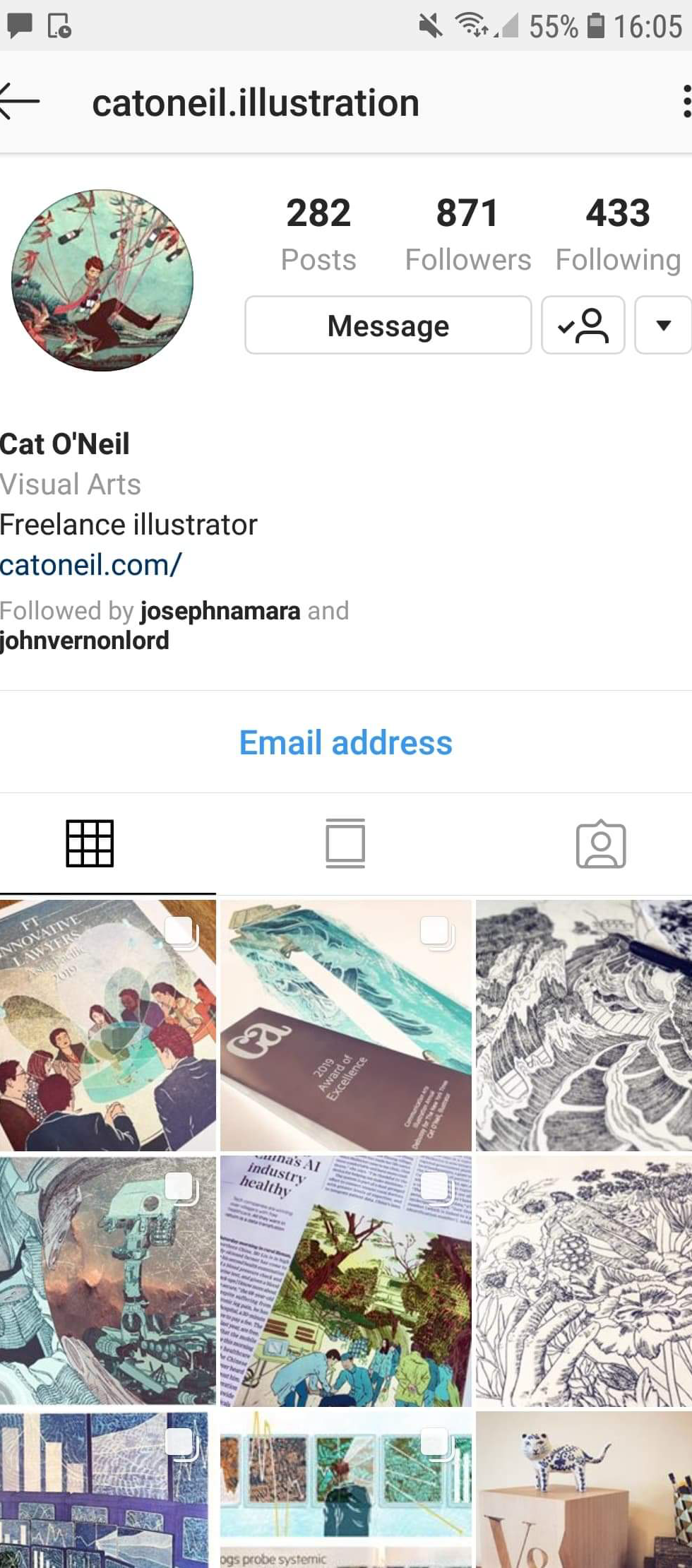
I reached out to Cat O'Neil through Instagram as this was the first platform I followed her on and messaged her straight away on that as I was really excited to here what she would have to say if she had time to speak to me.


Please see the slider gallery below of how I approached her. I contacted her a while ago and I understand how busy she must be therefore I told her not to worry about doing it straight away. We also agreed it would be best if she emailed the answers over. Rather excitingly she has replied which I appreciate massively! In this blog I will discuss how her answers and feedback will and have already helped me to develop my own work as a practitioner!
1. You're work is so beautifully delicate, you use so much intricate line detail within it. How do you balance your use of line and free space, how do you know when to stop adding line?
(I love loving line and always overdo it and never let me images breathe which my lecturers always say pulls down my work)
All artists have to pay attention to not 'overworking' an image, when you just put in unnecessary detail or if the addition of line actually takes away from an image. It's hard to pinpoint exactly how to know when is too much and when is not enough! The best way to develop your sense of this really is just to keep making more and more work, but also to critique it honestly. After you finish a piece, don't move straight on to the next one. Really look at it; what works well? What doesn't work? Why? Being aware of these things helps you when you do the next piece. Sometimes a fun experiment to do is to work on a line drawing and scan/photograph it at various stages, then look at those on your computer screen. Look at them as thumbnails next to each other and see which ons you like more than others, and analyse why. Don't be too precious with your work when you're at art school; you're there to experiment, not make perfect pieces each time. It can be tempting to work on a drawing with lots of detail, using all the skills you already know. But that's not the point of art school, the point is to try new things and learn new skills. Have you tried varying the heaviness/width of line you use? What about the materials? What about the size? I came to art school loving architecture pens and fine liners and A5 pads of paper, and I came out loving brushes, inks and brush pens and A3+ pads. The more you try, the more you either add to your skill set, or you find out it doesn't work for you and at least you know rather than just assuming.
2. How to you tackle colour being an illustrator that uses lots of line, both colour and line are such dominant features in your work yet neither is overpowering in your visuals?
Colour and line has been a long process of balance for me; it's a funny one. My husband can't separate out the way he thinks about colour and line, probably because he's a printmaker so the colour produces the form. For us line based artists, there is usually a separation in thought between the line and then adding in the colour. Again, learning how to balance this just comes with experience and making more and more images. One in-between step though is tone. I do use a lot of line work to define the shape, but I also frequently use mark making to create tone in my images, and sometimes when I'm working on colouring I actually put a hue/saturation layer over the whole thing and pull the saturation right down to b&w so that I'm just looking at the tone in an image. I mean, I don't really follow hard and fast rules when I'm making an image, I don't always do that and there are plenty of illustrations where I'm really just drawing the outline and figuring out all the colour/tone later! But that tends to be a result of experience, I know what effect I'm going to go for with the colour at some point and I just trust that I will be able to figure it out once I get to that point in making an image. The more work you make and analyse, the more you know how to tackle certain visual problems. When you feel you have successfully coloured a piece, analyse it; what exactly is working there? When you see work you like, analyse it. How do they use colour, what is appealing to you?
A really big part of being a good artist is being able to analyse your work, it's a continual process of making and analysing and you can't really do both at the same time (otherwise you get a bit stuck in your own head!) What I mean is every time you make a piece you should give yourself a bit of time to process it and learn from it. Don't worry about this as you make the piece, just make it, critique it then keep those things sort of in your general awareness for the future. I hope that makes sense!
I have already taken O'Neil's advice into account with my own work, regularly scanning my work in progress in as a gradually add detail and reviewing these frequently. I firmly agree that you have to critique your work to be able to develop as a practitioner and nothing is truly finished unless you've critiqued it yourself and thought of way it could communicate better or be more visually captivating. I always critique my work constantly and have been constantly trying new ways to battle my overreliance on line detail. I still feel like still haven't found the best way to work as a line artist and haven't fully developed my personal voice. However, as O'Neil states "Don't be too precious with your work when you're at art school; you're there to experiment, not make perfect pieces each time." It gives me confidence to continue trying new ways of creating
I feel it would be helpful to do a bit of a self critique in this blog. Maybe any readers could also help critique me. In an encouraging way! Something that struck me in the first semester of my second year was the below piece and the dilemma it placed me in. I love line detail and I felt using circles in various different sizes to create tone and varying densities was a really interesting visual. However, my lecturer told me my composition didn't work as a whole as it had no space to breathe due to the heavy mark making of rain outside the window. I felt that it wasn't too overwhelming so therefore I submitted this image as opposed to doing as my lecturer suggested and submitted a version without the line detail in the face. I chose to submit my version and I'm still not sure whether I regret it or not. I do see why it could seem overpowering as it detracts from the composition as a whole and makes the image very difficult to read. Something an illustration should be, easily read. Part of me still thinks it looks better with the circle detail, and I do believe as a creative you should keep your integrity but upon reflection, I think it would have been a more successful illustration if I had removed the lines. This line was the point I realise I need to tackle this problem.


I did this piece several months ago now and as I'm looking as the image I do see that the second more simplified image tells a story better.
I will continue to experiment with my style and how I use line in composition. Something my lecturer recently pointed out to me was that I do drawings and not illustrations which was a massive revelation to me because its so true. Therefore I'm trying really hard to create fun compositions that communicate something which is a massive challenge to me as someone who has settled into doing detailed drawings and then panicking and trying to compile them digitally into some from of unplanned composition. I've felt rather disheartened about the quality of my recent work after taking on this challenge but I feel I am getting the hang of it and Cat O'Neils words have really comforted my in regards to the fact she went into art school working in one media and out working in another as the states, "I came to art school loving architecture pens and fine liners and A5 pads of paper, and I came out loving brushes, inks and brush pens and A3+ pads." this gives me the confidence to experiment and make the most of this time where I can take risks.
Below is a typical drawing I would do and next to it is one of my recent submissions. You can see the image communicates far more when I've considered when you stop adding line detail and zooming the line out to not just focus on fur or circular mark making.
I'm still not won over by my execution of the second image, but I can now tell its a better illustration.


Finally I apologise if this blog post sounds like me talking about myself. It just me using these blogs to make sense of who I am as an illustrator. I feel honoured to have received advice from Cat O'Neil and as I am a visually learner I wanted to look at her recommendations and suggestions by looking at samples of it within my own work to help me understand!


Comments